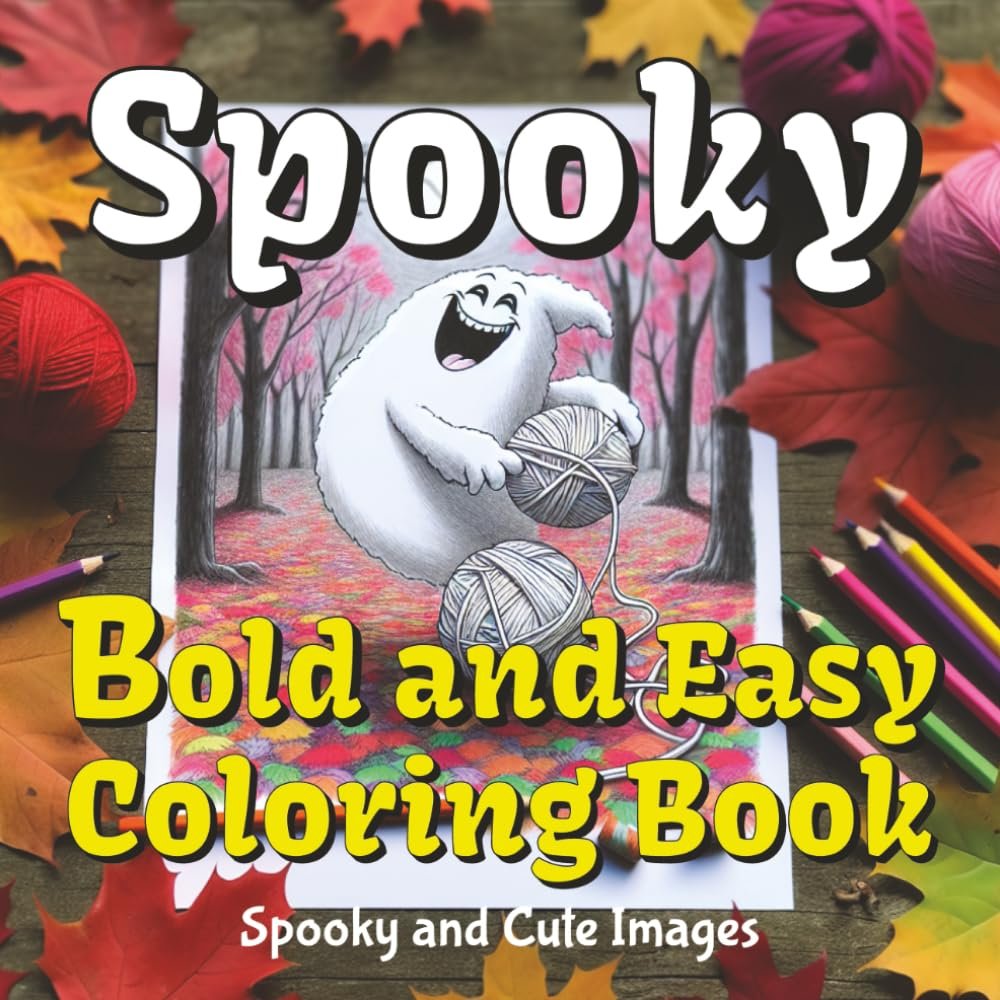
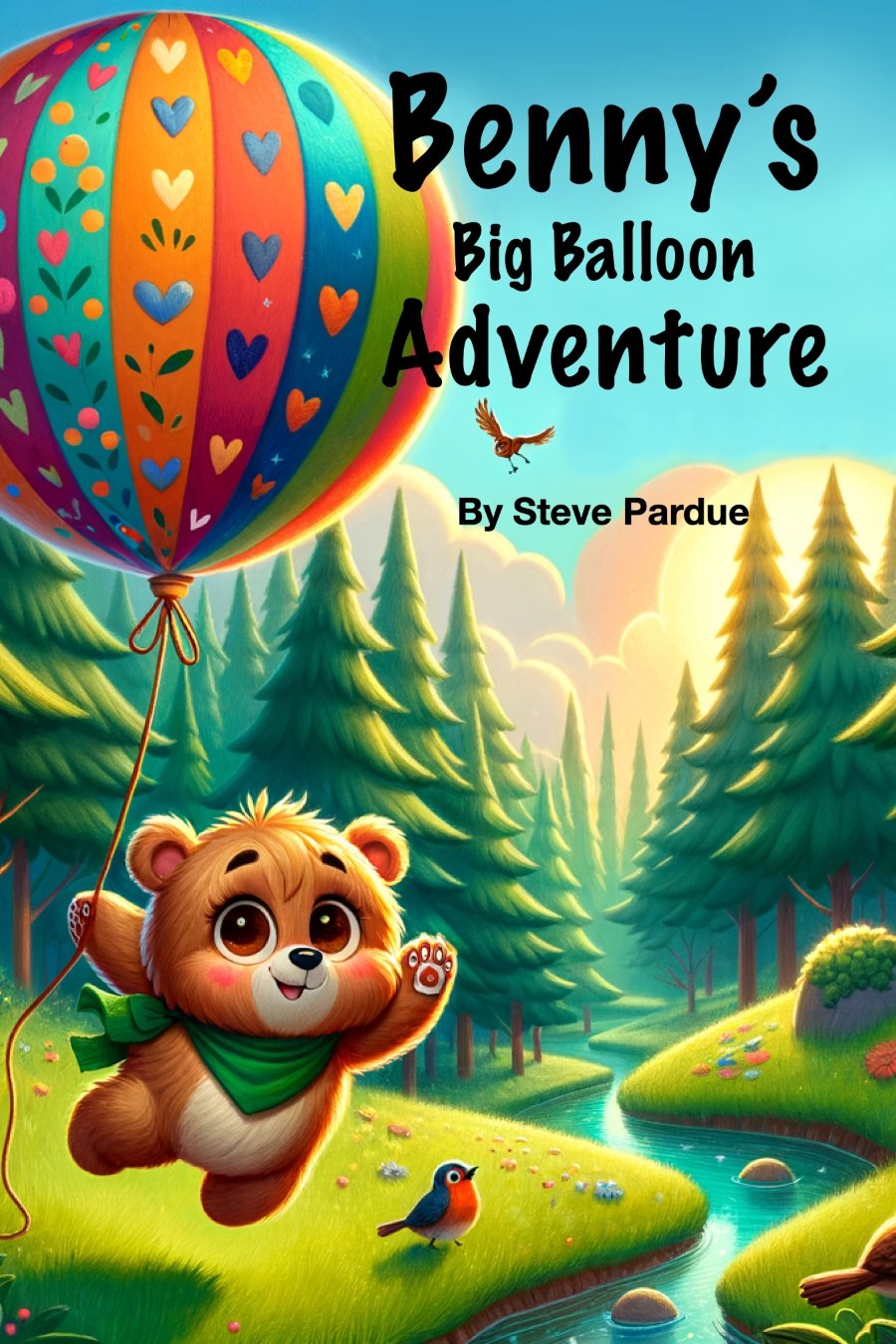
When I first dipped my toes into the world of desktop publishing, I was overwhelmed. The sheer number of tools, features, and options seemed endless, and I often found myself wondering how anyone managed to create those polished, professional-looking documents. But as I dug deeper and learned from seasoned experts, I realized that the key to mastering desktop publishing lies in understanding a few advanced strategies, uncovering hidden gems in the software, and tapping into expert insights that often go unnoticed.
One of the first things I learned is the importance of setting up your workspace correctly. It might seem like a minor detail, but it’s a game-changer. By customizing your toolbars, arranging your palettes, and setting up grids and guides, you can streamline your workflow and save yourself countless hours of frustration. This setup isn’t just about efficiency; it’s about creating an environment where your creativity can thrive. I remember the moment I rearranged my workspace for the first time—it felt like the software was finally working with me rather than against me.
Another hidden gem in desktop publishing is mastering the use of styles. Whether you’re working in Adobe InDesign, Word, or any other publishing software, styles are your best friend. Paragraph styles, character styles, and object styles allow you to maintain consistency across your entire document with just a few clicks. It’s like having a secret weapon that ensures your design looks professional, no matter how complex the project. I once spent hours manually adjusting fonts and spacing, only to discover that styles could have done the job in minutes. It was a humbling experience, but one that taught me the value of working smarter, not harder.
One expert insight that completely transformed my approach to desktop publishing was learning about the power of master pages. At first, the concept seemed a bit intimidating, but once I understood how master pages work, it was like a light bulb went off. Master pages allow you to create a consistent layout that can be applied across multiple pages of your document. Whether it’s page numbers, headers, or recurring design elements, master pages make it easy to keep your document uniform without having to duplicate your work. I can’t count how many times master pages have saved me from having to make tedious, repetitive adjustments to each page.
Color management is another advanced strategy that often goes overlooked but is crucial for producing high-quality printed materials. Understanding how to work with CMYK versus RGB, choosing the right color profiles, and calibrating your monitor can make all the difference in how your final product looks. I’ll never forget my first big print project—I was devastated when the colors came out completely different from what I saw on my screen. That experience taught me the importance of getting color management right from the start. It’s not just about aesthetics; it’s about ensuring that what you see is what you get, whether it’s on-screen or in print.
Typography is yet another area where expert insights can elevate your desktop publishing game. Choosing the right fonts, understanding kerning and leading, and knowing when to break the rules can turn a good design into a great one. I used to think that typography was just about picking a nice font, but I quickly learned that it’s much more nuanced than that. The way text interacts with the other elements on the page can either enhance your message or detract from it. By paying attention to the details—like avoiding widows and orphans or aligning text precisely—you can create a document that not only looks great but also communicates your message clearly and effectively.
Finally, one of the most valuable hidden gems I discovered was the importance of maintaining a strong visual hierarchy in your design. This concept is all about guiding the reader’s eye to the most important elements on the page, ensuring that your message is conveyed effectively. Whether you’re designing a brochure, a newsletter, or a book, visual hierarchy helps you organize your content in a way that makes it easy for the reader to navigate. I used to struggle with cluttered, confusing layouts until I learned how to use size, color, and placement to create a clear, logical flow of information. It was a simple shift, but it made a world of difference in the quality of my work.
As I continued to hone my skills in desktop publishing, I realized that the real magic lies in combining these advanced strategies, uncovering hidden gems, and applying expert insights. It’s not about knowing every tool and feature—it’s about understanding how to use the right ones at the right time. Every project is a learning experience, and the more you experiment and explore, the more confident and capable you’ll become. So, whether you’re just starting or looking to take your skills to the next level, remember that there’s always something new to learn and discover in the world of desktop publishing.
I can provide any kind of typesetting you need as well as layout and design to create Booklets, Brochures, Magazines, Forms, Charts, etc.


